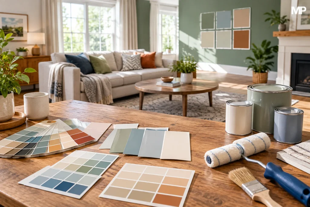

Choosing a paint color can look easy until you stand in front of a wall of nearly identical samples. One shade may look warm in the store but gray at home. Another may appear soft online but become much brighter in direct sunlight. The best paint choice is not simply the color you like most on a sample card. It needs to work with your lighting, furniture, flooring, room size, and the atmosphere you want to create.
Current interior-design guidance also recommends testing colors in the actual room before committing. Lighting can change throughout the day, while existing materials can reveal undertones you may not notice on a small paint chip. Taking a little time to compare samples can prevent an expensive repaint later.
Quick Info
| Factor | What to Consider |
| Room purpose | Decide whether the space should feel calm, warm, energetic, formal, or relaxed |
| Natural light | Check how much sunlight enters and from which direction |
| Artificial light | Consider the color temperature of your bulbs |
| Existing décor | Match or complement flooring, furniture, rugs, cabinets, and artwork |
| Undertones | Look for hidden blue, green, yellow, pink, gray, or brown tones |
| LRV | Check how much light the paint reflects |
| Room size | Lighter shades can feel more open, while darker shades can add depth |
| Color flow | Make connected rooms feel visually compatible |
| Samples | Test large samples in the actual space |
| Paint finish | Select a sheen appropriate for the room and desired appearance |
Start With the Feeling You Want
Before comparing dozens of shades, decide how you want the room to feel.
A bedroom might need a quieter atmosphere, while a dining room could handle something richer and more dramatic. A home office may benefit from a color that feels focused without becoming distracting. The goal is not to follow a universal rule but to connect the color with the way you actually use the space.
Recent guidance from Martha Stewart recommends starting with the purpose and feeling of the room before settling on a shade. Designers interviewed for the publication also recommend considering the architecture and materials already present.
Think about the room at different times of day. Do you want it to feel bright and relaxed, cozy and intimate, natural, sophisticated, or energetic? Having an answer makes the selection process much easier.
Look at Your Existing Décor
Paint should rarely be chosen in isolation.
Look at your flooring, sofa, curtains, rugs, cabinets, countertops, artwork, wood trim, and other permanent or expensive elements. These features already contain colors and undertones, and your wall color needs to work alongside them.
For example, warm wood floors may look very different next to a cool gray than they do beside a warm beige. A blue-gray wall can emphasize cool tones in surrounding materials, while a warmer neutral can make wood and cream-colored furnishings feel more connected.
Angi’s updated 2026 guidance similarly recommends considering existing furniture and décor when selecting interior paint because the wall color should complement the things already in the room.
Start with the elements you cannot easily change. It is usually easier to select paint around an existing floor or countertop than to replace those features because the wall color does not work.
Pay Attention to Natural Light
Lighting is one of the biggest reasons a paint color can look different from one home to another.
The direction of a window affects the quality of natural light entering the room. Sherwin-Williams notes that north-facing rooms often receive cooler light, while warmer exposures can bring out creamier or warmer qualities in certain colors.
This does not mean you have to avoid a particular color because of your window direction. Instead, use the information to understand how your chosen shade may behave.
A color that looks perfectly balanced in a bright showroom could appear cooler in a room with limited daylight. Likewise, strong warm sunlight can make some neutrals look creamier than expected.
Always evaluate the color where you plan to use it.
Don’t Ignore Artificial Lighting
Natural sunlight is only part of the picture.
You may love your new wall color during the afternoon, but your family probably spends time in the room after sunset too. Artificial lighting can change the appearance of paint considerably.
Benjamin Moore explains that lightbulb color temperature influences whether a paint color appears warmer or cooler. Its guidance notes that bulbs above about 3,500K tend to produce cooler-looking light, while lower color temperatures generally create warmer illumination.
This is especially important in bedrooms, living rooms, dining areas, and home offices where artificial lighting is used frequently.
When testing a color, turn on the room’s normal lamps and overhead lights. Judge the sample under the lighting you actually live with.
Learn About Undertones
Undertones are one of the easiest things to overlook.
A paint may look like a simple white, beige, gray, or green at first glance, but it can contain another subtle color underneath. A gray may lean blue, green, violet, or brown. A white may appear warmer because of yellow, cream, or pink undertones.
Sherwin-Williams explains that comparing colors next to each other can make undertones easier to identify. Lighting can also emphasize those hidden qualities.
This is why a gray that looks neutral on a store card might appear noticeably blue once it is placed beside warm wood flooring.
Never judge a neutral by its name alone. Compare it with the materials already in your room.
Compare Similar Colors Together
If you have narrowed your choices to three or four shades, put them beside one another.
This makes subtle differences much easier to see.
Instead of comparing a warm white today and a cool white tomorrow, place them together on large sample boards or separate sections of the wall. You may suddenly notice that one has a yellow undertone while another has a cleaner appearance.
The same technique works with beige, gray, green, blue, and other color families.
Comparing related shades is especially helpful when the colors appear almost identical on a small card.
Understand LRV
Light Reflectance Value, or LRV, is another useful measurement when choosing paint.
Sherwin-Williams describes LRV as a scale from 0 to 100, representing how much light a color reflects. A lower number indicates less reflected light, while a higher number indicates more.
You do not need to become an expert in LRV to use it.
If a room receives limited daylight and you want a lighter appearance, looking at higher-LRV options can help narrow the field. Darker colors with lower reflectance can create a richer, more enclosed atmosphere.
However, LRV should be treated as one piece of information rather than a rule. A high-LRV color is not automatically better for every room.
Think About Room Size
Paint can influence how large or intimate a room feels.
Light colors often help a small space appear more open and airy. Darker colors can make a large room feel more intimate and visually grounded. Angi’s current guidance makes a similar distinction between lighter shades for openness and deeper shades for coziness and depth.
But don’t assume a small room must always be white.
A dark bedroom, reading nook, or study can look intentional and comfortable. The important question is whether the visual effect matches what you want from the room.
Room size should guide your choice, not dictate it.
Choose Based on Room Purpose
Different rooms serve different functions.
For a bedroom, you may prefer muted greens, soft blues, warm neutrals, or other colors that create a quieter environment. A dining room can accommodate stronger colors if you want more visual presence. A home office may work well with a balanced neutral or a more distinctive shade that supports the personality of the space.
Recent Angi guidance similarly recommends connecting color selection with the desired mood and function of the room.
There is no single correct color for a specific room.
Your daily experience of the space matters more than a rigid decorating rule.
Don’t Choose From a Phone Screen
Online inspiration is useful, but it should not be your final test.
A digital image can look different depending on the camera, screen, brightness settings, surrounding colors, and lighting conditions. Even color-matching technology has limitations because photographs and displays can affect how a shade is perceived.
Use online photos to discover ideas and narrow your preferences.
Then bring actual samples into your home.
This simple step can prevent the common experience of buying several gallons of paint only to discover that the color feels completely different on the wall.
Test Large Samples
Small paint chips are useful for narrowing down options, but they do not always show how a color will behave across a large wall.
Martha Stewart’s March 2026 guidance recommends generous samples or large removable samples and observing them in the actual space. The designers featured in that article recommend evaluating samples under changing light before making the final decision.
Benjamin Moore also recommends applying a paint sample and observing it under different lighting conditions.
Paint a reasonably large area or use large removable sample boards.
Then move the samples around the room if possible.
A color can look different on a sunny wall, a shaded wall, and a wall beside dark furniture.
Check the Color Morning and Night
Do not make your final decision after looking at a sample for five minutes.
Watch it through different parts of the day.
Morning sunlight may reveal one undertone. Midday light may make the color appear brighter. Afternoon shadows can deepen it, while warm lamps may change its appearance after sunset. Martha Stewart’s current expert guidance specifically recommends studying samples at different times of day before committing.
If possible, live with your samples for several days.
The right color should make sense in the real conditions of your home, not just in one perfect moment.
Create Flow Between Rooms
Choosing each room independently can make a home feel visually disconnected, particularly when doors remain open and several spaces are visible at once.
You do not need to use the same paint throughout the house.
Instead, look for relationships between colors. Similar undertones, repeated neutrals, or a coordinated palette can help rooms transition naturally.
This is particularly important in open floor plans, where several functional areas occupy one visual space. Current Angi guidance recommends building a cohesive color scheme and testing large samples before committing.
Think of your home as one connected palette rather than a collection of unrelated rooms.
Don’t Forget the Ceiling and Trim
Walls are not the only surfaces affected by color.
Trim, doors, ceilings, cabinets, and other architectural details can influence how the wall shade looks. A bright white trim may make a wall appear more colorful, while a warmer trim can soften the contrast.
If you are keeping existing trim, examine its undertone before choosing your wall paint.
In some designs, using closely related colors on walls and trim can create a quieter appearance. In others, stronger contrast can emphasize architectural details. There is no universal answer. The important thing is to consider these surfaces before buying the paint.
Choose the Finish Separately
Color and finish are two different decisions.
The finish controls how much light reflects from the painted surface and also affects practical characteristics such as cleanability and durability.
A color can therefore look slightly different depending on the sheen used.
Angi’s 2026 guidance notes that paint finish affects durability and light reflection, while Sherwin-Williams also recommends considering sheen when selecting and coordinating interior colors.
For a complete project, choose the color first and then select the finish appropriate for the room and surface.
Use Bold Colors With a Plan
There is nothing wrong with choosing a bold wall color.
The key is to understand what else is happening in the room.
If the furniture, artwork, rug, flooring, and accessories are already visually strong, an intense wall color may create a busy appearance. If the rest of the room is restrained, a stronger wall shade can become an intentional focal point.
You can also use a bold color in a smaller area rather than covering every wall.
A dramatic color works best when it feels connected to the rest of the room.
Common Mistakes to Avoid
Several mistakes appear repeatedly when people choose interior paint.
Choosing a color only from an online photograph is one.
Another is ignoring undertones. A third is failing to consider how natural and artificial light affect the wall.
Buying paint before testing a sample can also be costly.
Another common problem is choosing a wall color without looking at existing floors, cabinets, furniture, and textiles.
Finally, people sometimes select a shade because it is currently popular even though they do not actually like living with it.
Trends can provide inspiration, but your home should still feel like your home.
A Simple Selection Process
If the entire process feels overwhelming, make it smaller.
First, decide how you want the room to feel.
Next, examine the furniture, flooring, cabinetry, fabrics, and other fixed elements.
Then consider natural light and artificial lighting.
Choose a few related colors rather than collecting dozens.
Compare their undertones.
Check LRV when brightness or darkness is important.
Bring large samples into the room.
Watch them throughout the day.
Finally, choose the shade that works with the room as a whole.
This process takes more time than picking a color from a card, but it can make the final decision much easier.
Final Thoughts
The best tips for picking a paint color for home are surprisingly practical: look at the room first, not the paint card. Consider the furniture and permanent finishes, understand how sunlight and artificial lighting affect color, pay attention to undertones, and use LRV when you need help comparing brightness.
Most importantly, test the actual paint in your own space. Current 2026 advice from designers and major paint resources consistently emphasizes real-world sampling because a shade can change considerably depending on light, surrounding materials, and time of day. There is no single paint color that works perfectly for every home. The right choice is the one that fits your room, your existing finishes, your lighting, and the way you want to feel when you live in the space.
FAQs
How do I choose the right paint color for my home?
Start by considering the room’s purpose, existing furniture and finishes, natural light, and the mood you want. Then narrow your choices and test large samples in the actual room.
Should I test paint before buying it?
Yes. Testing is one of the most useful steps because lighting, furniture, flooring, and surrounding colors can change how a shade appears. Current 2026 guidance recommends observing samples at different times of day.
What is an undertone in paint?
An undertone is the subtle color beneath the main visible color. For example, a gray can have blue, green, violet, or brown undertones. These become especially noticeable when the paint is placed next to other colors.
What does LRV mean in paint?
LRV means Light Reflectance Value. It uses a 0–100 scale to describe how much light a paint color reflects. Lower values reflect less light, while higher values reflect more.
Should every room in a house have the same color?
No. Different rooms can have different colors, but using related tones or consistent undertones can create better visual flow between connected spaces. This is especially useful in open floor plans.



Pingback: How to Make a Minimalist TV Stand That Works in Any Room - magazinepanda.blog
Pingback: How to Repair Chipped Paint: A Complete Step-by-Step Guide - magazinepanda.blog