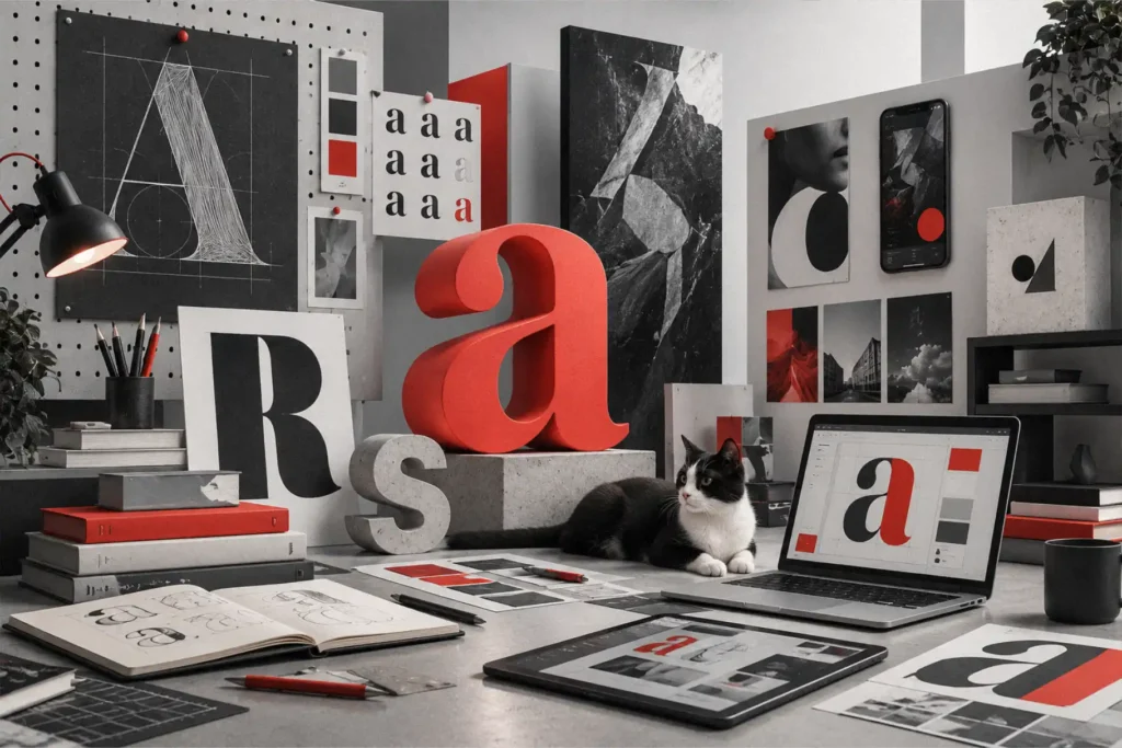

Look at the logos you see every day. Google. Coca-Cola. FedEx. Netflix. Notice something? Most are just words, styled well. No icon riding shotgun next to the name, no abstract shape trying to mean something. Just type, carrying the whole business name on its own.
That’s not an accident. Businesses are leaning into the typography logo because it works. It’s clean, adaptable, and carries a kind of quiet confidence. If you’re rethinking your business brand identity right now, chances are your logo design company has already steered the conversation this way, and there’s a real reason it keeps coming up.
What Is a Typography Logo, Really?
It’s a logo built almost entirely from text. The brand name is the visual. Coca-Cola’s script feels nostalgic. Google’s rounded letters feel approachable. Neither needs a separate symbol to make its point. The letters carry it all.
A combination mark still puts a symbol next to the name. A typography logo cuts that step out entirely and pours everything into the logo font: its shape, its spacing, the small custom touches that make it recognizable.
Why Brands Are Moving This Direction
Screens got smaller, and there are more of them. A logo now has to hold up on a phone, a smartwatch face, a browser tab, and a billboard, sometimes all in the same week. Detailed icons often blur or muddy at tiny sizes. Clean lettering just handles that shrinkage better.
Icon fatigue is real. For years, every brand wanted its own leaf, swoosh, or abstract blob standing in for “growth” or “innovation.” Eventually they all started blurring together. A typography logo skips that problem. There’s no icon competing for space in someone’s memory.
It removes a mental step. When the name is the logo, nobody has to translate a symbol back into a brand name. They read it, and it sticks.
The Business Case, Not Just the Aesthetic
This shift isn’t only about looking modern. There’s strategy underneath it.
Recognition Happens Faster
Strong logo typography gets recognized from the shape of the letters alone, sometimes at a glance, sometimes from across a room. That’s why so many rebrands start with the type, long before anyone touches an icon.
It Scales Without Falling Apart
Modern branding isn’t a business card and a storefront sign anymore. It’s app icons, video intros, merch, email signatures, social banners. A well-built typography logo moves across all of that without needing a separate version for every platform.
It Reads as Honest
There’s something stripped-back about a brand that doesn’t hide behind a mascot. It’s just the name, doing the work. People notice that, even if they’d struggle to explain why.
Examples Worth Studying
Airbnb, Slack, and Spotify all lean on a distinctive font for logo use instead of a decorative icon doing the heavy lifting. Even older, legacy companies have simplified their marks over the decades, trading ornate crests for cleaner type. Design research from Nielsen Norman Group backs this up: simpler visual systems tend to perform better across digital touchpoints, since they ask less of the viewer’s attention.
That matters more than it sounds. Every extra second spent decoding a logo is a second not spent on the actual message.
What Separates a Good Typography Logo From a Forgettable One
Not every wordmark earns its keep. Typing your business name in a nice font isn’t the same as building a real typography logo.
Custom Letterforms
The strongest typography logos rarely use a font straight out of the box. Designers reshape individual letters, adjust spacing, and sometimes redraw entire characters, enough that the mark can’t be mistaken for anyone else’s. This is where a creative typography logo earns that word: the font is a starting point, not the finished product.
Personality in the Type
A law firm and a children’s toy brand have no business using the same lettering style. Weight, curves, spacing. All of it should match the feeling you’re going for. Serious, playful, luxurious, approachable. Picking the right logo font is most of the battle.
Spacing People Notice Without Naming
Letters set too tight or too loose feel wrong, even to someone with zero design training. Good kerning is invisible when it’s done right. It just reads as polished instead of homemade.
Most of the real design hours on a project like this go here, with top-rated logo design companies fine-tuning spacing and weight long after the font itself has been chosen.
Does Every Brand Need One?
Not always. A brand built around a strong mascot, or one in an industry where symbols carry real meaning at a glance, may still need an icon doing some of the talking.
But for most modern brands, especially ones with a name worth remembering, going type-first holds up well over time. Research from Harvard Business Review points in the same direction: simplicity and consistency in visual identity tend to build stronger brand equity than novelty does.
Final Thought
The typography logo keeps gaining ground because it solves a real problem: it lets a brand name do exactly what it’s supposed to do, which is get remembered. If you’re reworking your identity, it’s worth asking one plain question: Does this need an icon, or can the letters carry it alone?
Sometimes the simplest answer is the strongest one.
Read More From Magazinepanda